WUNDERKAMMERN ANTHOLOGY
September 2020
Tools used: Adobe Illustrator, InDesign
I designed an anthology series featuring a collection of essays of folklore tales based on the essay Greenland Unicorn And The Magical Alicorn By Natalie Lawrence. For the book cover design I used a monochromatic cover scheme, with expressive typography to simulate going down a hole. My inspiration was Alice in Wonderland. Not only does Alice in Wonderland fit the theme of The Cabinets of Wonders and Other Mythical Creatures, I also pulled inspiration from the rabbit hole in Alice in Wonderland since this anthology is a deep dive into the wonders of mythical creatures and folklore.
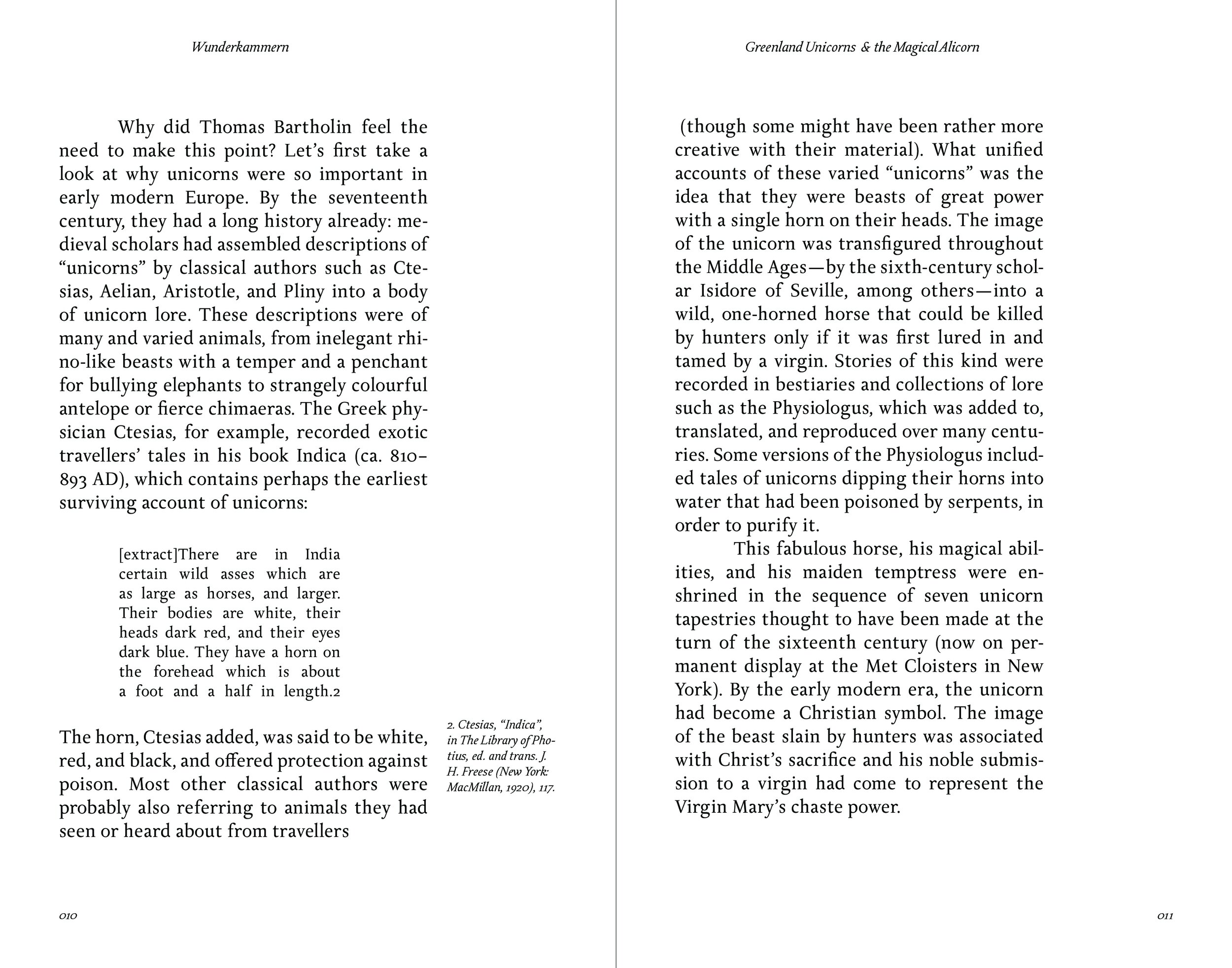
For my chapter opener system I aligned the title to the center of the text, rather than the page. I did this because I felt that since the text is justified to the left, the title would look cleaner if it was centered to the text rather than to the center of the page. I also included the Dek at the beginning of the chapter as an introduction to the text. I made the Dek 8pt rather than 12pt to emphasize that it is an introduction rather than a part of the body copy. For my body copy, I have it fully justified and centered to the left, with a space for notes on the right. I also used a drop cap for the first letter of the chapter as a way to draw the eye to start reading. I have also made the body copy 12pt. I felt that 12pt was a good size because it is a good size relative to the page size, and this typeface has good readability at a small size. For the notes section, there is a column separating the body copy from the notes, and the notes are justified to the left.
For the folio system, I have decided to center the book name and chapter title to the left justified body copy to continue my system of justifying text to the center of the body copy. By justifying text to the center of the body copy, I am also matching the interior of the book to the exterior by centering the text within the system, without centering it to the page, just like how the title on the front cover is centered within the circle, but not centered to the page. For the extract, I have indented the copy on either side and have lowered the point size to 10pt. For the page numbers, they are 8pt and they are justified to the left and are aligned to the same column as the body copy.


