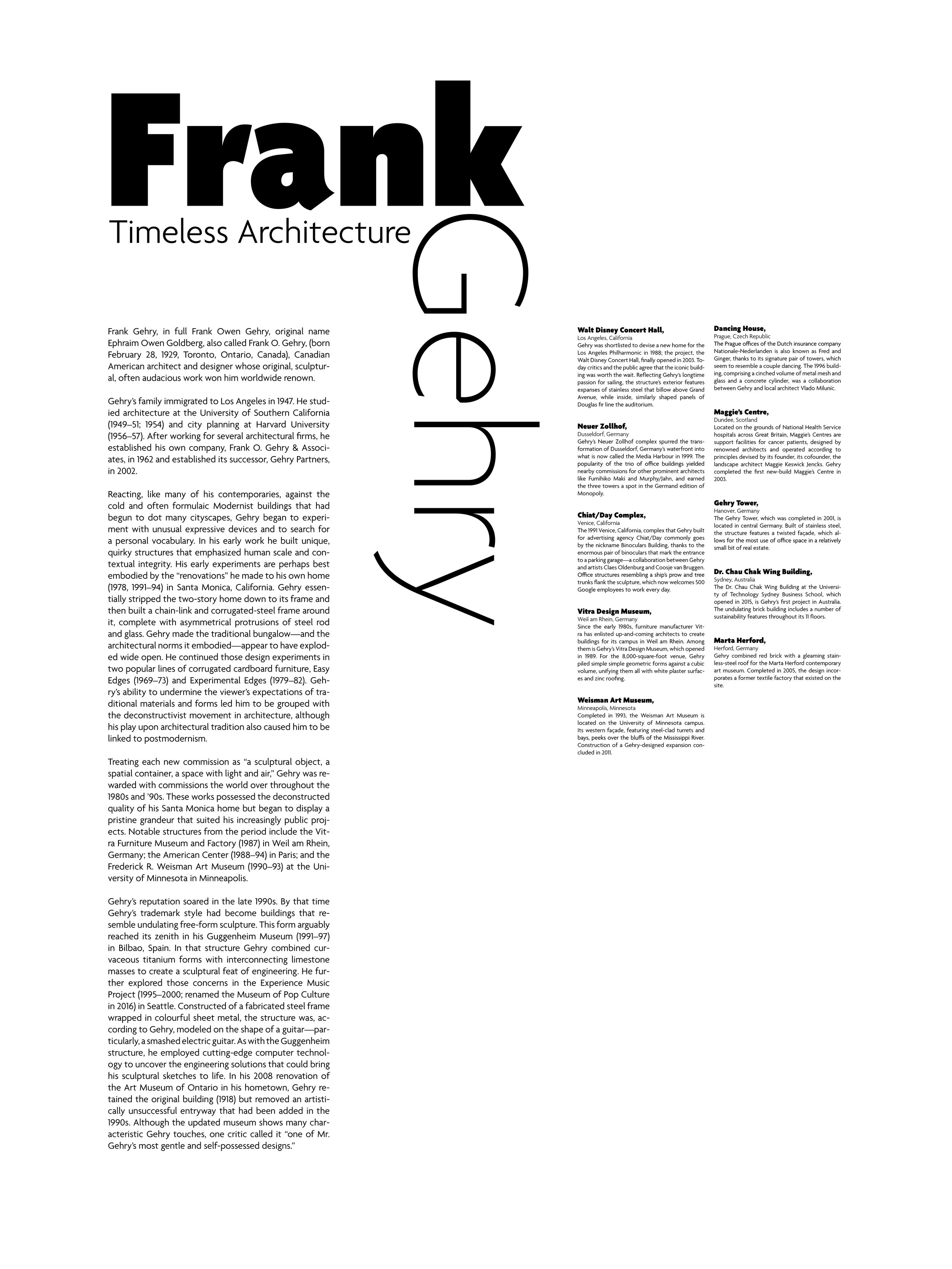
FRANK GEHRY POSTER
October 2020
Tools used: Adobe Illustrator, InDesign
A denotative and connotative poster inspired by the architect Frank Ghery.
For the denotative poster design, I wanted to show the more straight edge and sophisticated side of Frank Gehry’s architecture. Although Frank Gehry is known for his outrageous and crazy architecture, his contrasting sharp lines are what make his design. I portrayed this through the fun and curvy sans serif typeface Agenda, as well as, through the sharp edges formed with the body copy.
For the connotative poster design, I portrayed the overthetop and outrageous curvatures that Frank Gehry is most well known for. I used the curves from the Neuer Zollhof, in Dusseldorf, Germany designed by Frank Ghery. I used the typeface Bodoni 72 to help capture the curves and harsh angles of the Neuer Zollhof.


