CELEBRITY PERSONA
April 2023
Tools used: Adobe Illustrator, Photoshop, InDesign
Celebrity Persona: An exploration of Creative Identities is an exploratory book that features three case studies focusing on the design elements of how a celebrity persona is created as a means to tell a story.
My thesis question was; How does design contribute to the creation of persona and how does persona contribute to performance?
A persona is a long term character that is different from how a person acts, dresses, performs, and looks, typically for entertainment or storytelling purposes. A persona is created as an extension of themselves to present to the public for an extended period of time. Personas have been used by those in the public eye for years as a way to change their public image, draw attention to themselves, and to signify a new era in their life and career. A deep dive into why celebrities create personas, the deconstruction of the design elements of a persona, and how persona can elevate a performance are all important to examine when dissecting what forms a successful persona.
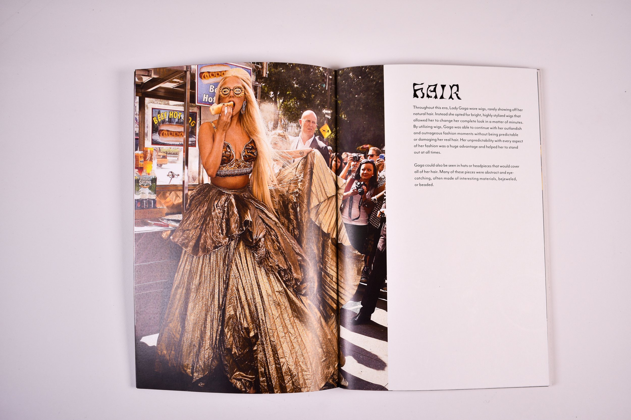
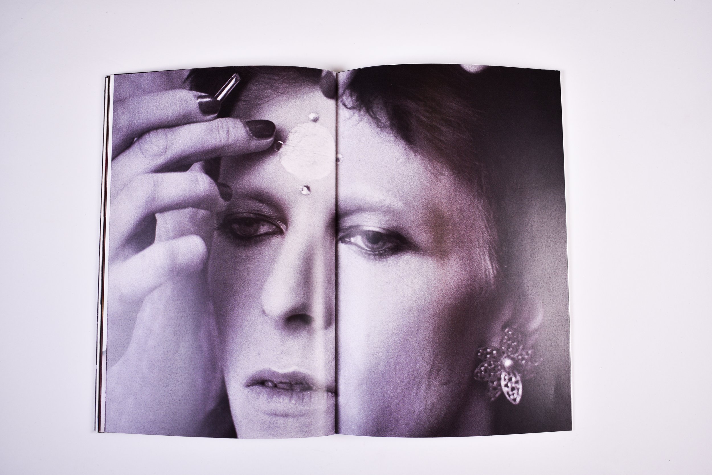
By dissecting design elements such as character design, hair, makeup, outfit, attitude, surroundings and set design, and seeing how they interact with performances such as social media posts, public appearances, music videos, concerts, and interviews, I am hoping to understand how one enhances the other when developing and promoting a creative identity for celebrity personas.
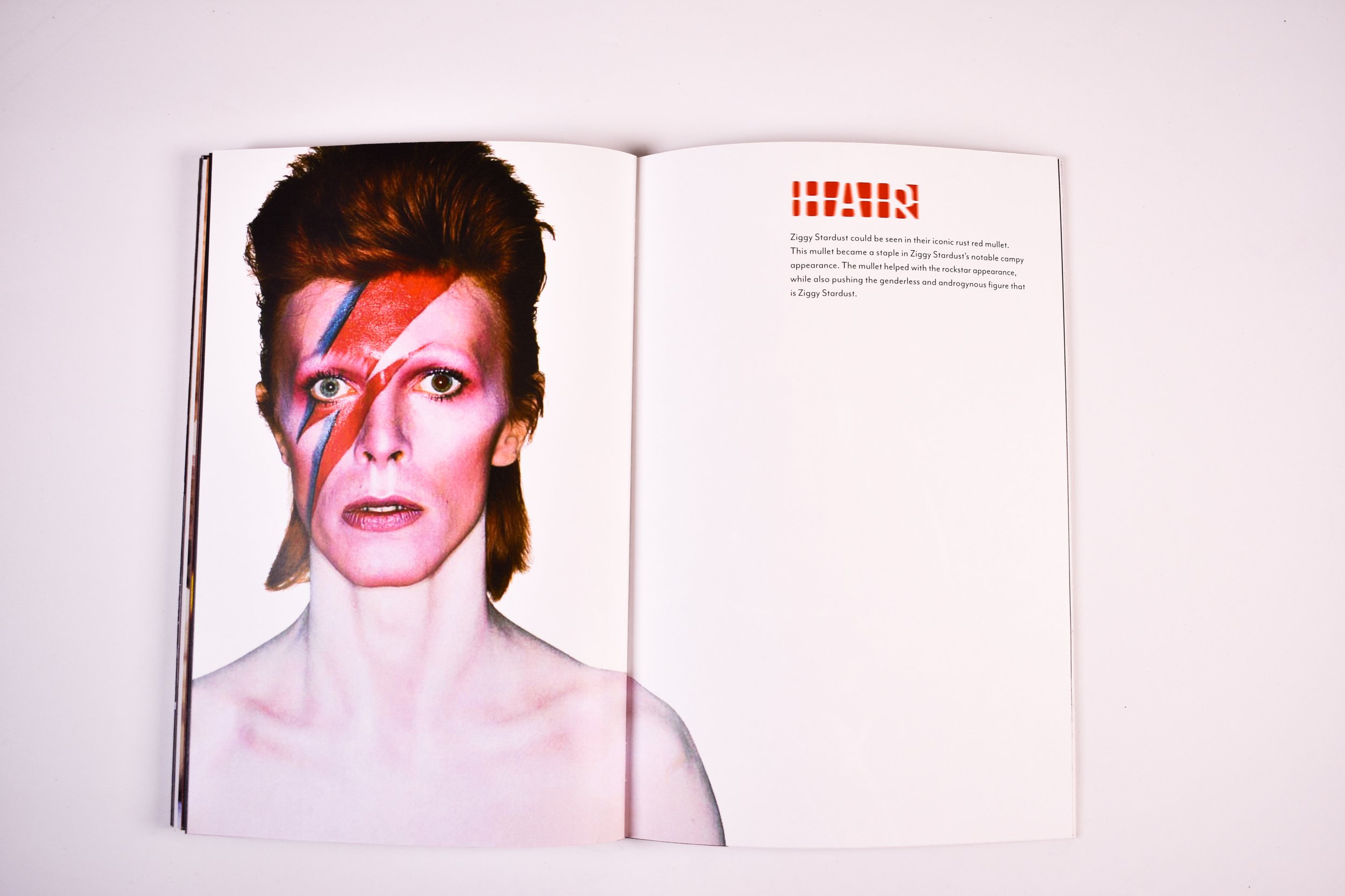
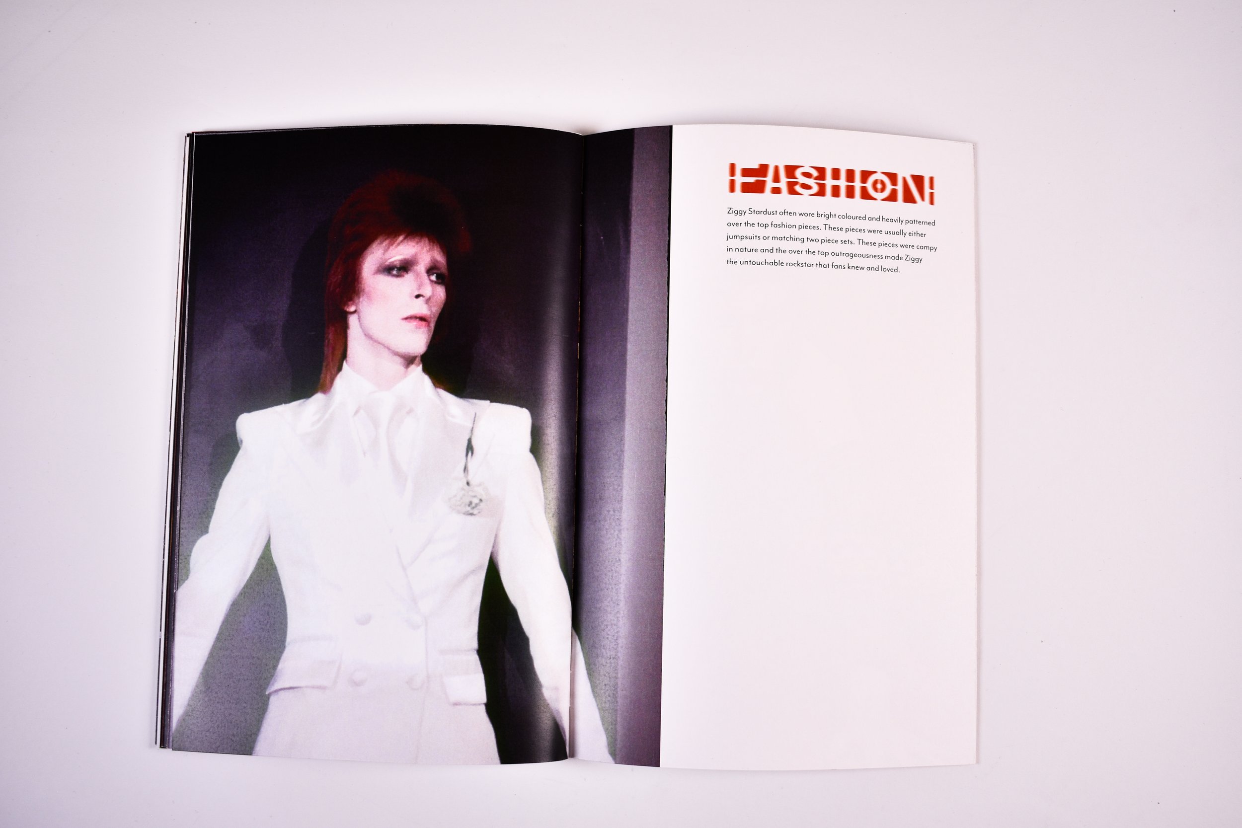
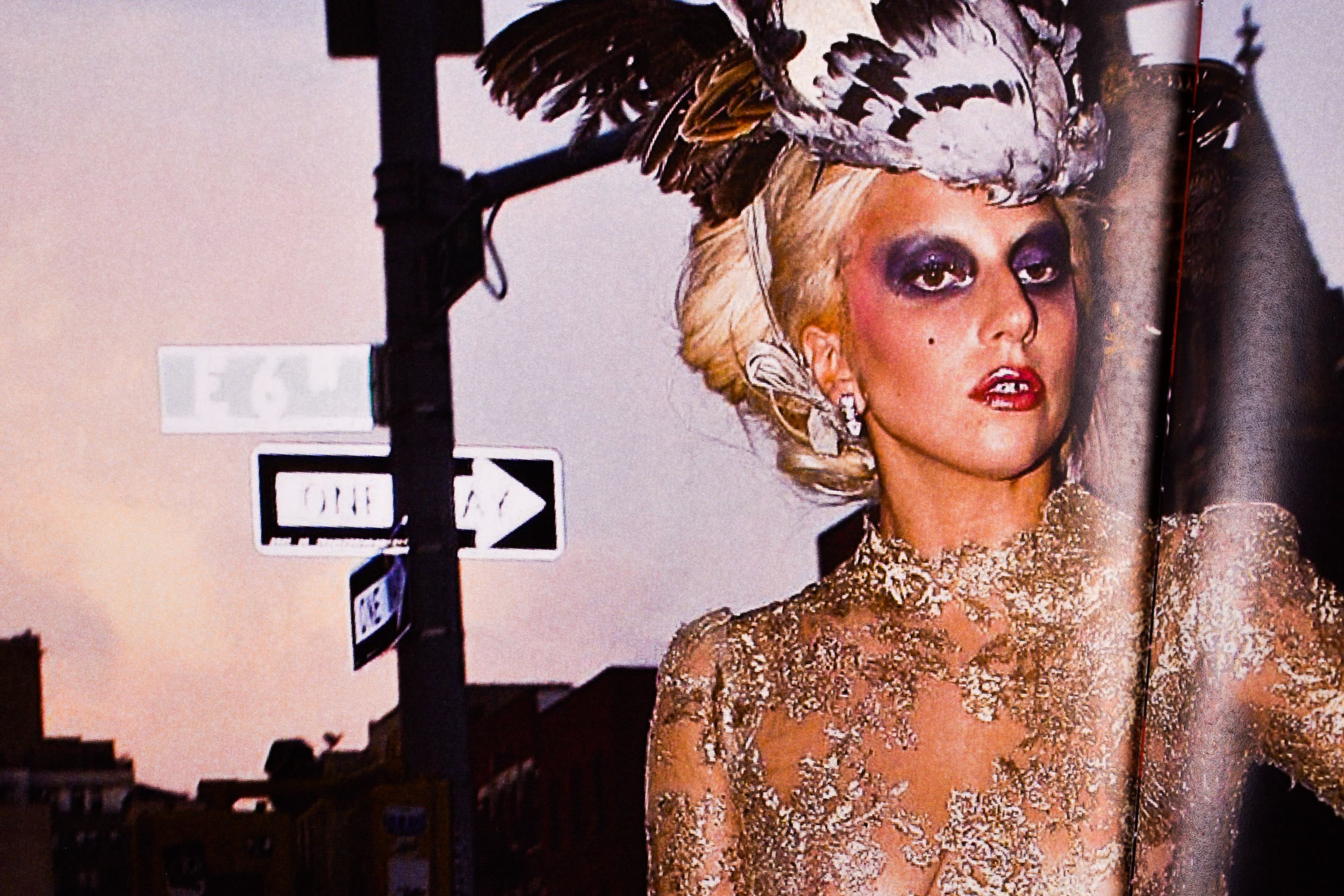
After 12 weeks of research, I finally began the process of creating and designing this book. The three case studies include Lady Gaga, Tyler, the Creator, and Ziggy Stardust. Each with their own very distinct visual aesthetic, I chose these celebrity personas because of their strong design elements.
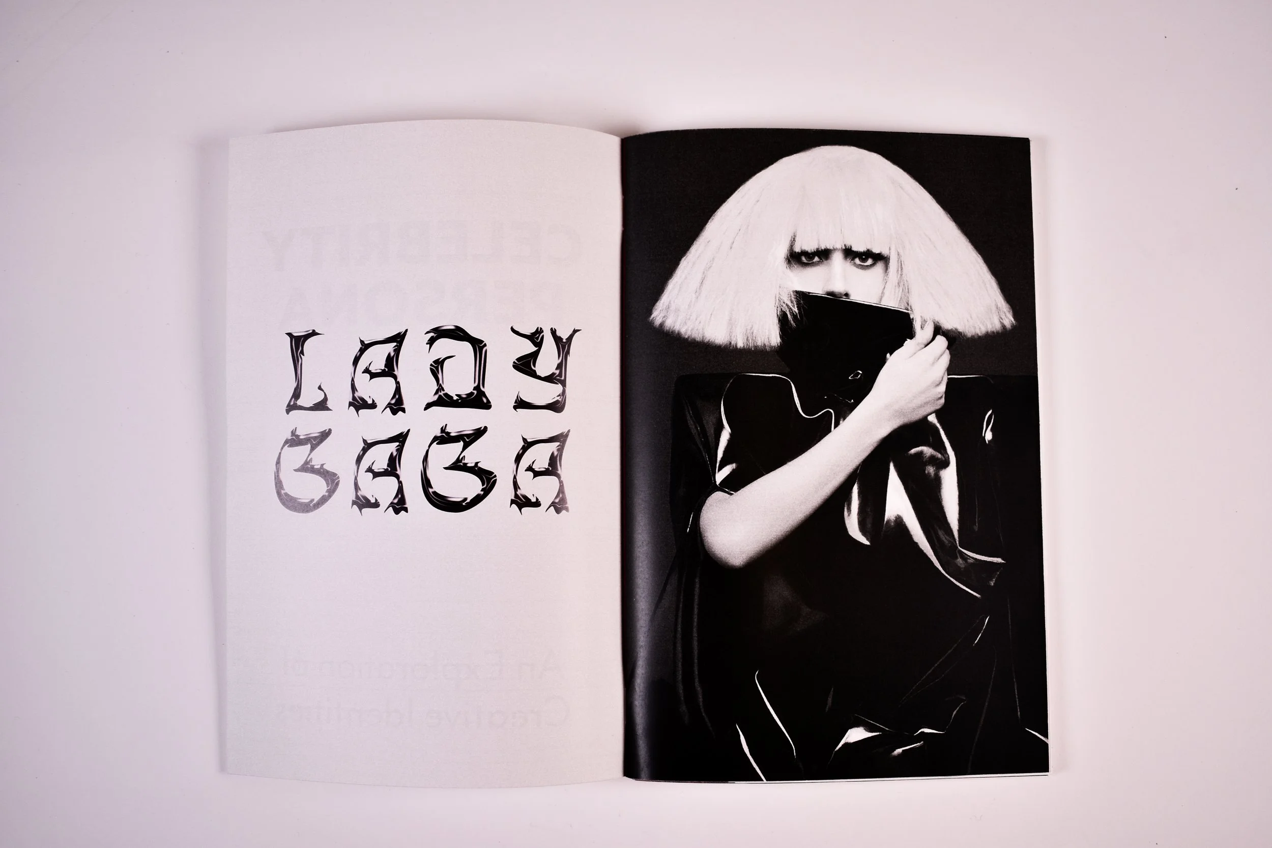
One of the unique design elements I wanted to use was a unique typeface for the headings. I created three typefaces that were tailored to each case study and that spoke to the impressions of the case studies.
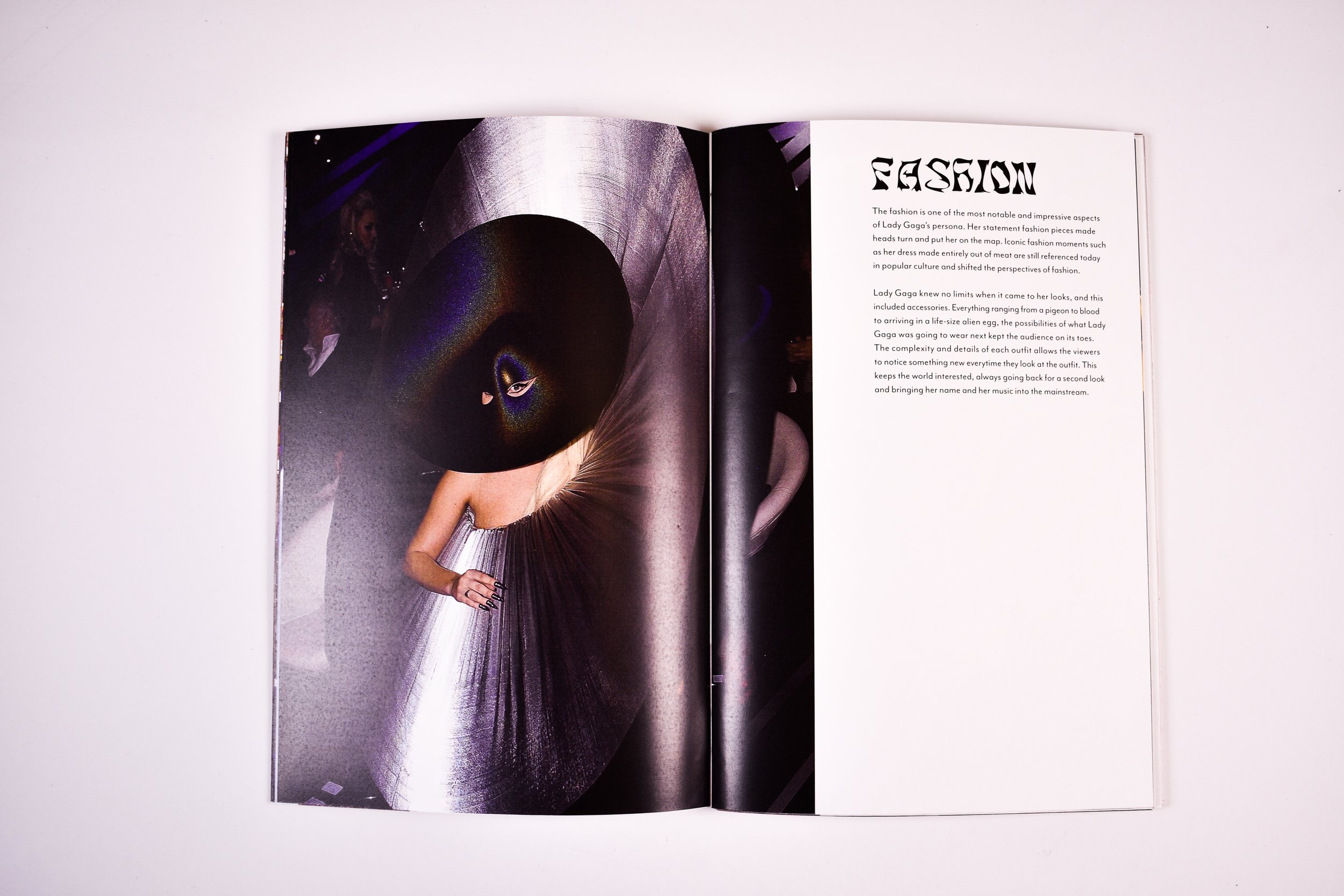
The first typeface was for Lady Gaga. I wanted to create something harsh and outrageous as a means to make a statement, just like her creative identity. I added a metallic effect for the opener to match the shine of her leather jacket, and then moved on to a flat black version for the other spreads.
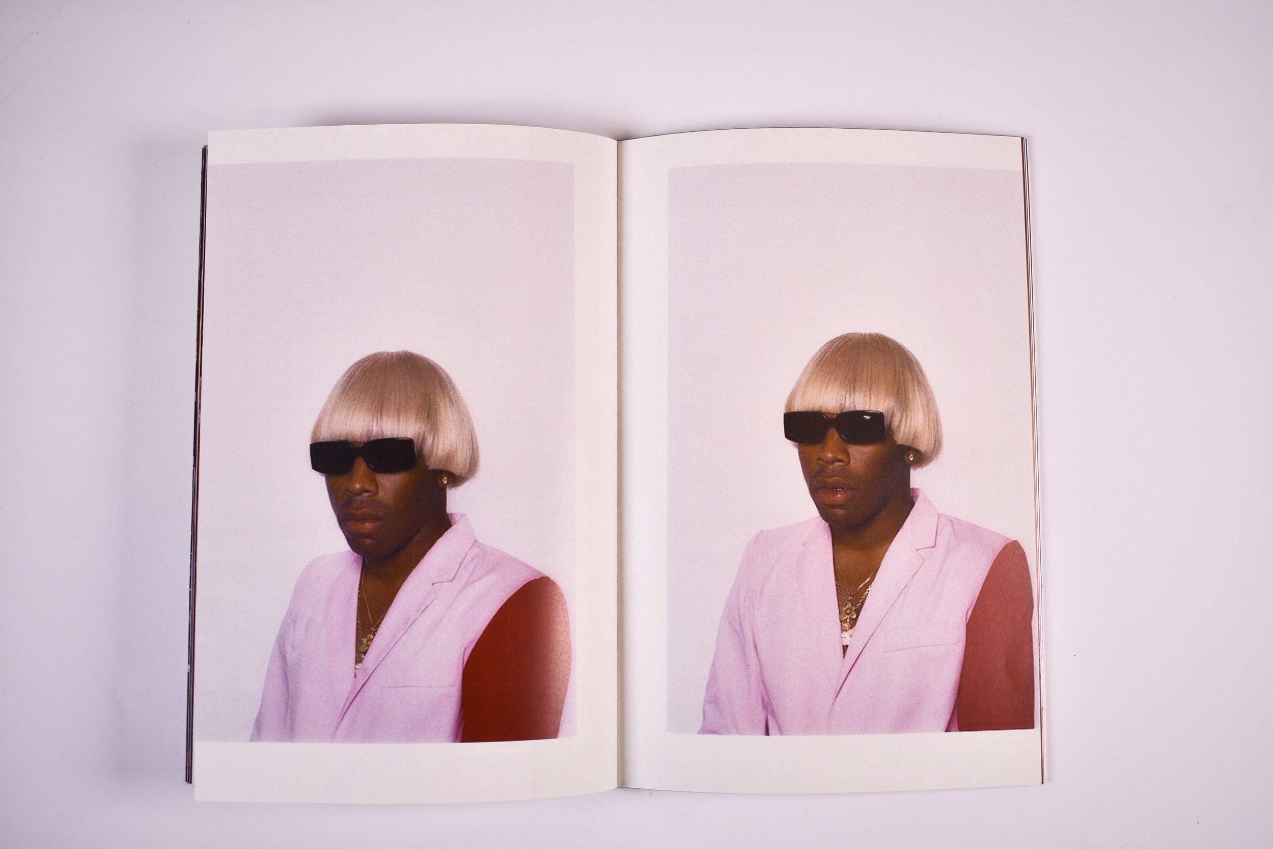
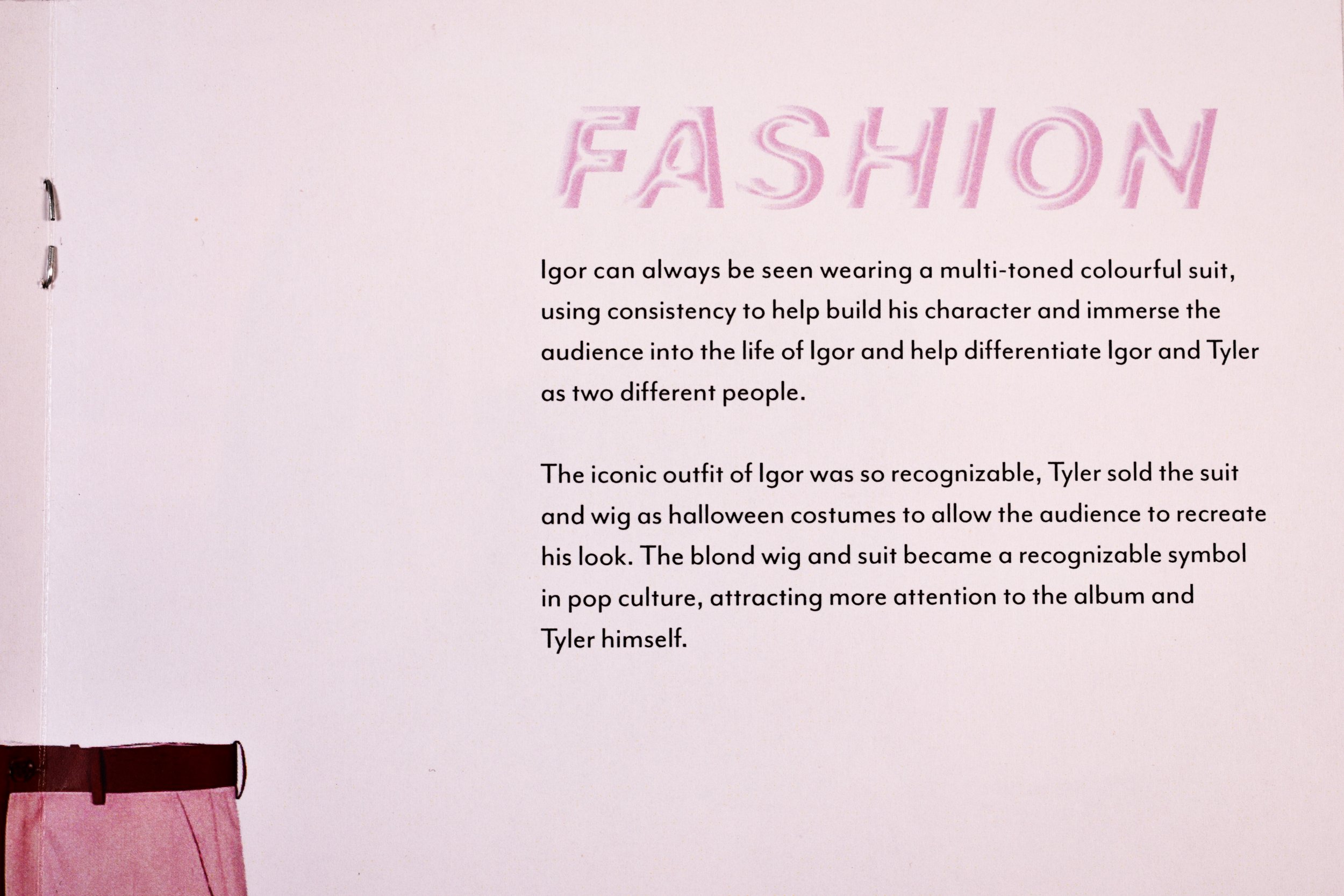
The second typeface I created was for Igor. Igor’s story is about feeling invisible to the one you love. I created something sweet yet transparent to show how Igor was feeling and create a visual that matches his creative identity.
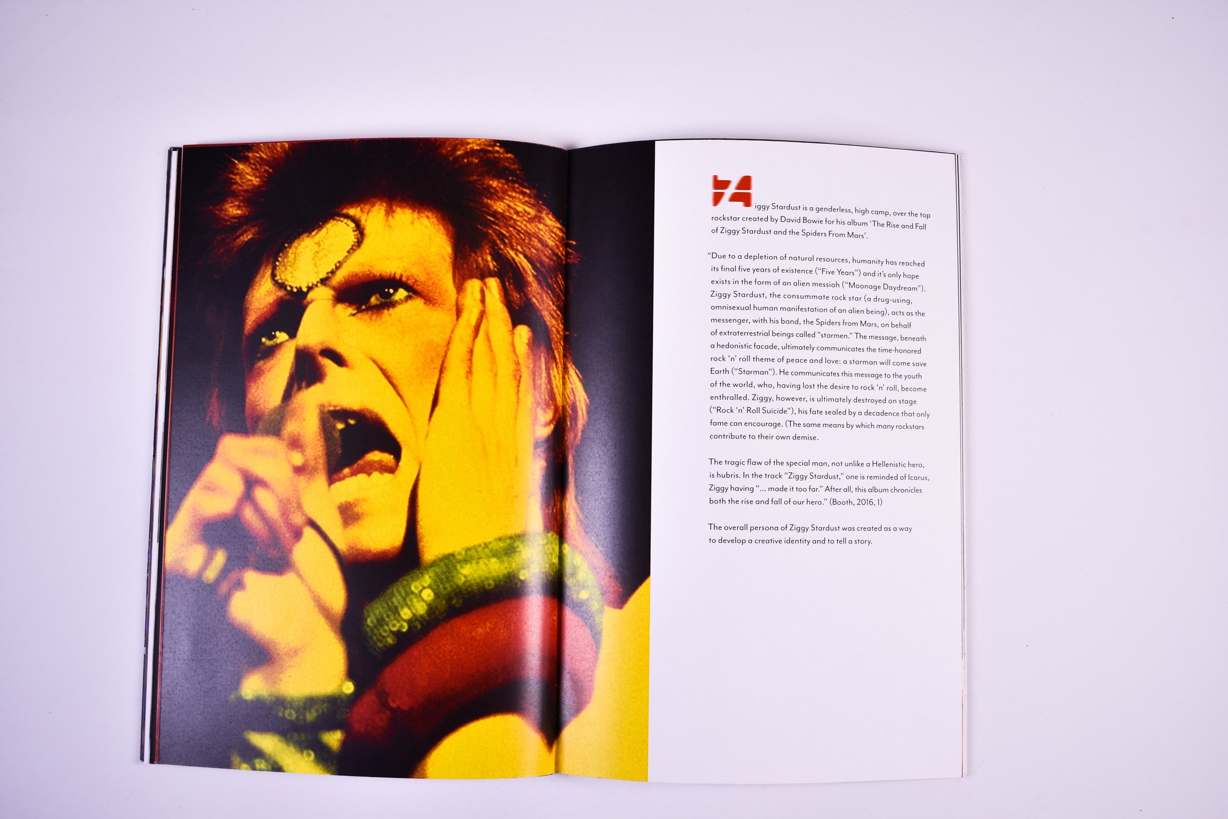
The final typeface was for Ziggy Stardust. This typeface was about blurring the lines between human and alien with an unconventional typeface. This blocky and blurry typeface speaks to the heavy presence Ziggy Stardust had with a bold red and unique shapes, it speaks to his character.
